Box Art Disparity: One Reason Why
A Great Console Bombed in the US
|
| 23 August 2009
Back in the early 1990s, the Internet was barely born and hadn't been commercialized yet, so you had to depend on good, old print media to inform you about the latest video games. This media always lagged substantially behind the new releases, so the box art for games represented a level of importance that seems foreign by today's standards. In other words, when you walked into a store that sold video games, the box art held a strong influence over whether or not you bought it.
Huge sums of money were spent developing games, yet one seemingly afterthought piece of art for the cover of a game held drastic sway over consumers. Given different cultural and religious perspectives, international marketing was bound to change—even fundamentally revise—the original art for games released outside of Japan. After all, you have to cater to your audience. Would American's appreciate things like the anime art style?
In the case of the TurboGrafx-16 (known as the PC-Engine in Japan), the localization of game artwork would prove disastrous. The TG-16 already faced a steep uphill battle against the entrenched NES. That the TG-16's games actually looked worse (merely judging from the box) than their Japanese brethren made this challenge even harder to surmount. Hudson Soft and other game developers created some brilliant artwork the Japanese. Perhaps not coincidentally, the PC-Engine was a huge success in Japan, even beating out the Family Computer (aka NES). Nevertheless, the company in charge of marketing in America, NEC, felt the need to—ahem—adjust or "improve" box art visuals. The result was nothing short of calamitous.
Here are ten examples. Many more abound, but rather than scrape the bottom of the barrel, this list focuses on games that range from good (i.e. Be Ball) to amazing (i.e. Soldier Blade). Imagine marketing some of the best games ever released for TurboGrafx-16 like this. I dare you to compare. Is it any wonder that the TG-16 failed to make a splash in the United States? |
|
|
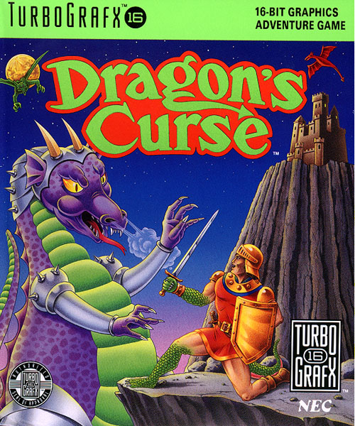 |
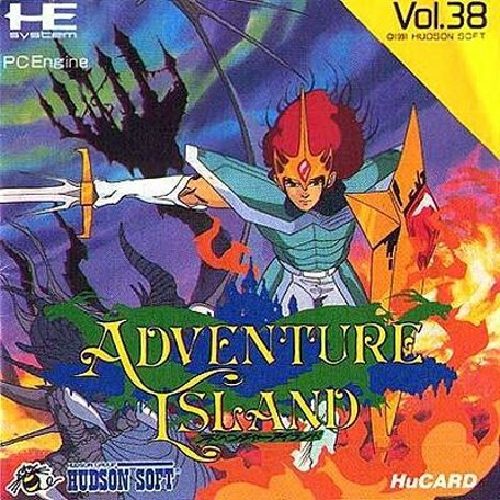
Solid anime-style art, a sword fighter with an evil, dark castle (possible toppling) in the background. Explosive flames in the foreground for good measure, and an interesting splash of green behind the title, showing the silhouettes of two dragons. Exciting stuff! |
|
What sort of battle stance is that? Kneeling on one knee to fight a dragon? Maybe exceptional tactics are necessary to deal with such a hideous green and purple monster. This is an ugly picture in general, with red and orange tones making the clash of colors even worse. |
|
|
|
 |
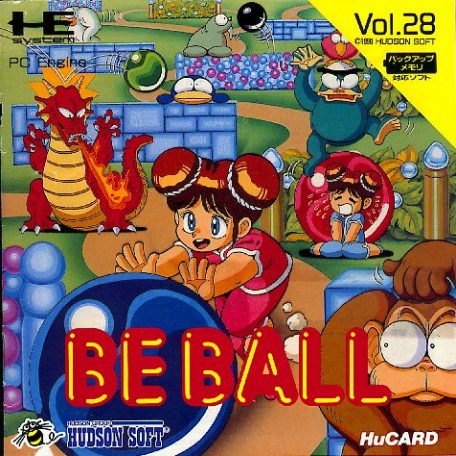
This surely isn't going to win any art awards, but at least its bright and colorful, displays a sense of humor, and demonstrates that pushing large marbles is an essential part of the gameplay. |
|
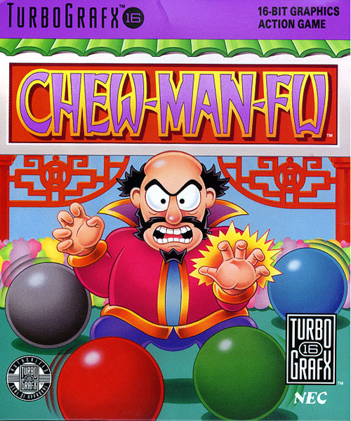
What on earth is going on here? Is the wizard using magic to juggle these balls? The title and red pillars in the background make it sound like there's a Chinese theme to the game, but other than that who knows? |
|
|
|
 |
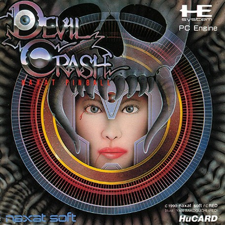
Beautiful, twisted, and even tragic, depending on how you look at it. Is this an evil ice princess, or someone who's possessed, as the skull surrounding her head (maybe enslaving her?) suggests? It's a fine work of art and great marketing, too, showing that what you have here is much more than your typical pinball game. |
|
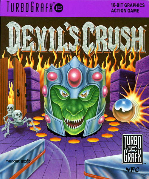
Before you even begin to interpret the picture, the horrible clashing of green, purple, and orange jolts your eyeballs. The focus on a lizard and the undead also makes the game feel far removed from the human aspects depicted on japanese box art. Ironically, the ugly composition belies the brilliant visuals of the actual game. |
|
|
|
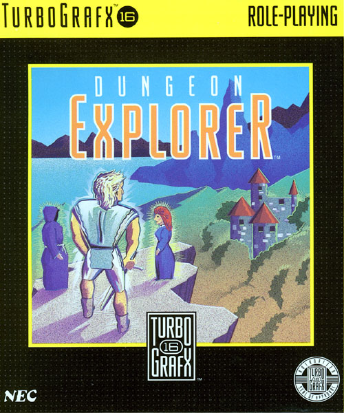 |
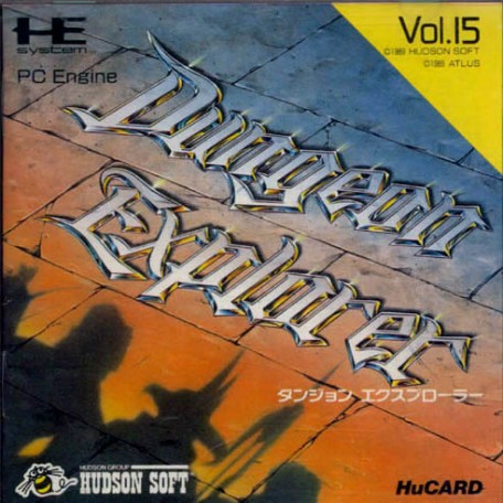
The wall background is a nice accent to the title, providing a dungeon atmosphere. The shadow characters are a nice accent, too, suggesting encounters with a variety of creatures and weapons, or perhaps multiple players teaming up together. |
|
The swordsman looks especially awkward, one hand clumsily holding his weapon and the other holding...his smaller weapon? The castle bland, abstract art style does little to explain anything about the game and even less to encourage you to make the purchase. |
|
|
|
 |
Flying aliens descending on a distant planet. Probably invading. Endless swarms, judging from the queue that disappears behind the goofy guy that leads the way. Looks like we're in sci-fi land, defending against an alien invasion. An original and intriguing portrayal. |
|
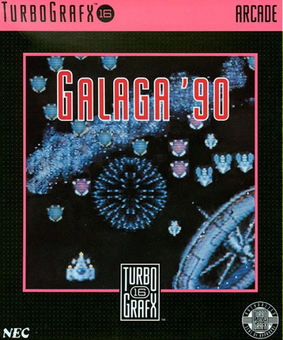
The overly-pixilated and washed out cover art suggests anything but the kind of game you'd expect to see in 1990. It looks much more like 1982. While there is a firework-like explosion, it's incredible that you don't see a single shot being fired in this image. WTF? |
|
|
|
 |
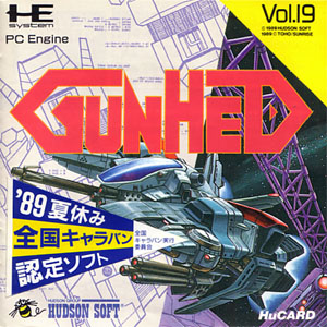
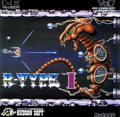
Complex schematics and engineered have helped create one hell of a gunship, which brandishes a variety of weapons. Not sure what we're fighting, but it looks like there will be intense battles ahead. |
|
Your diminutive ship can fire dull laser blasts. Deep space is fairly empty and dull. It does contain some sort of alien ship, but it looks awkward and doesn't appear to pose a substantial threat. Does it even have weapons? |
|
|
|
 |
No themes rock the boat here, but at least the composition is solid. Defending a damsel in distress like usual. An evil black night in pursuit, probably after that crystal the lady holds aloft. Not sure what that monster is in the upper left, but it adds nice depth to the image. |
|
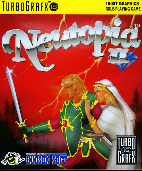
Could a prince-princess pair look any lamer or cheesier than this? Sword, shield, armor, and lightning. Can it get any more trite or boring? Making the composition even worse, you have 75% of the picture dominated by the title and the borning red background. |
|
|
|
 |
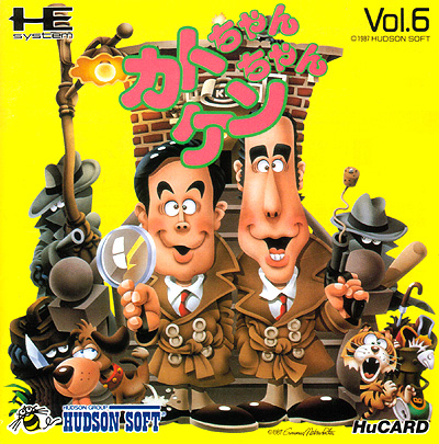
The art style looks like a claymation still—definitely a distinctive approach that stands out. Judging from the cork gun and the dog taking a leak, you'll find lots of humor in this title. Enemies abound, but they look pretty goofy, too. Funny, amusing, and curious. |
|
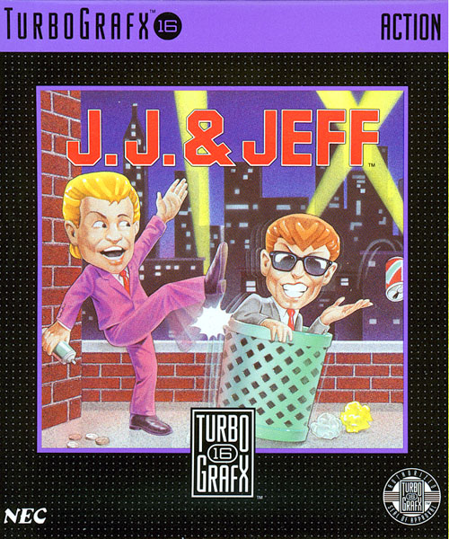
Is that a gameshow host, kicking someone in a trash can? And I guess the latter has something against soda cans? And we're located in a big city, apparently. Nothing here begins to explain the game or pique your curiousity, not to mention make you want to pull out your wallet. |
|
|
|
 |
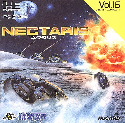
The moonscape, lasers shooting into the sky, a large explosion, and Tron-like motorcycles. You can't help but sense the war, excitement, and science fiction—quite a good teaser for any fan of video games in general. |
|
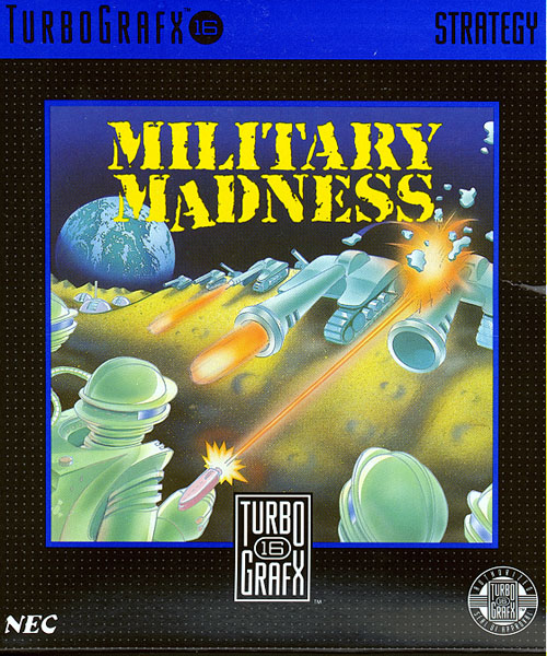
Earth in the background (we must be on the moon), blasts, and tanks. The imagery is similar, but the execution is terrible. Isn't cover art supposed to look better than a game's real graphics? |
|
|
|
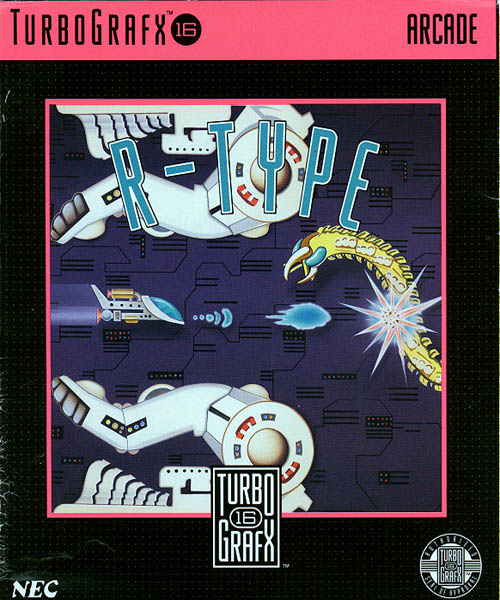 |
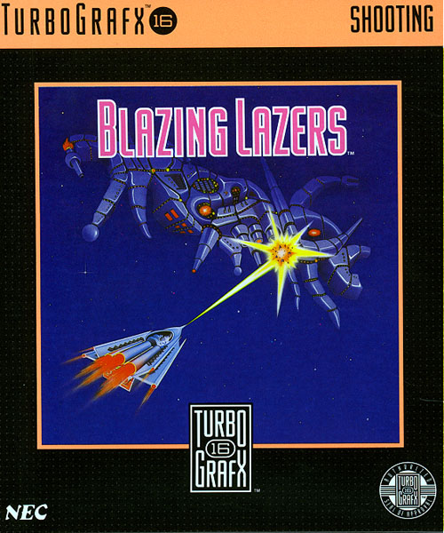
One little spaceship with a nifty three-way shot against a giant alien with detached eyeballs. It's daunting, horrifying, and brilliant all at once. You really get the sense of machine versus alien. Vivid, to the point, and a fine picture of what makes a shoot 'em up. |
|
On the other hand, here's a clunky ship that fires large blaster shots against a much less menacing snake-like alien. The bland white colors showing the arms above and below the ship dominate the composition. Perhaps they're more important? Or maybe this art just sucks. |
|
|
|