Sega CD and Mega CD Disc Art
Across the Regions
|
29 February 2012
Regional differences only begin with boxes (check out the original Sega CD Box Art Disparity feature). Open that box, and you'll discover the disc inside also possesses its own quirks of localization. How much effort went into pressing the disc, itself? Is it little more than an expanse of silver with a monochromatic title? Perhaps you're treated the addition of a small artistic composition. Better still, you could be lucky enough to have an entire animated scene printed on the disc, as if it was lifted directly from manga. Like many aspects of video game marketing, you'll find stark regional differences. Hopefully, this feature will illuminate some of the compelling discrepancies. |
|
| |
|
|
|
|
|
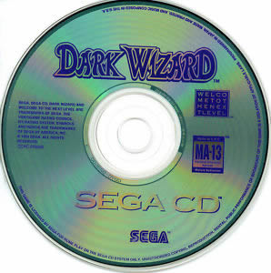
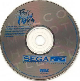
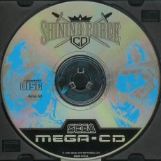
The real disc looks even less impressive than the scan above. There are literally only two colors (blue and white) beyond the natural silver one. Minimal color palettes can look great, but on this disc the maturity rating, Sega branding, and "welcometothenextlevel" take up more space than the title. If you're going to not bother with any real artistic composition, at least make the title look cool! |
|
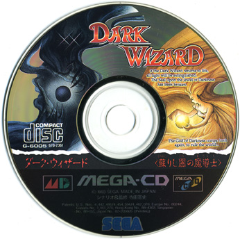
As the name suggests, we find a Dark Wizard enveloped in shadows and an apparently benevolent—if the light colors are any indicator—sorceress opposing him. Though the figures are pretty abstract, the swirling and indistinct patterns they share in common bring the two halves of the composition together nicely. Too bad they wasted so much canvas on the bottom with labeling. |
|
Compared to the previous U.S. effort, alternating shades of blue angling in diagonal fashion is a significant approvement. Nevertheless, there's no real composition here to analyze, merely some colors behind the bland title. |
|
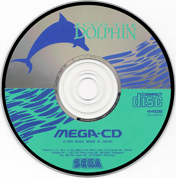
As simple with its two shades of blue as this may be, it's an iconic and effective composition that jumps off the disc, grabbing your attention. The leaping dolphin obviously alludes to the gameplay, something you'll get to immediately experience during the first stage.
|
|
Here we have something much more ambitious, but unfortunately it also fails spectacularly. With only one color and such detail, you can't even make sense of what's going on. Maybe it looks great if you squint at it up close, but in general this composition needs to be either simplified or get a big boost in contrast—maybe add another color?
|
|
|
|
|
|
|
|
Compared to where we started with Dark Wizard, this is a humorous change. Now the title is really small and cramped but a giant WELCOMETOTHENEXTLEVEL is embossed across the whole disc, making it look even worse! |
|
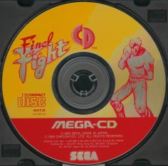
Definitely a garish choice of colors. At least the title and Cody pop out. Note how much better the title looks with a decent font size, and the small bit of real art easily defines the genre as a beat 'em up. A welcome improvement over the American version of the disc. |
|
This is clearly the best version, featuring all three playable characters and gratuitous splatters of blood. The latter is especially amusing when you consider that the graphics are nothing like Mortal Kombat. Haggar's pose is odd, showing off his bulk, but otherwise this is a stellar effort. |
|
| |
|
|
|
|
|
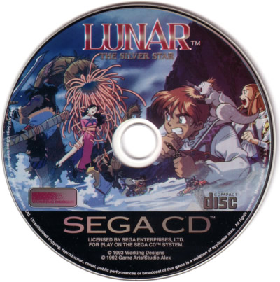
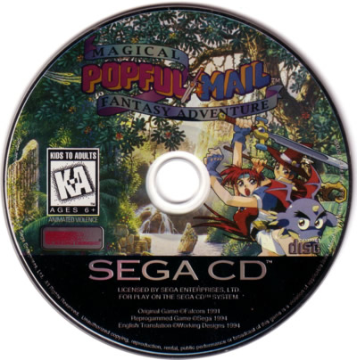
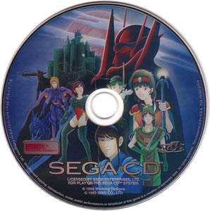
Whoa! Something has fundamentally changed here. That would be Working Designs, a now-defunct localization company that helped pioneer new (expensive) standards for game packaging in the United States. This composition is a little busy, but basically you have four heroes (plus Nall) fighting a monster that looks like a sea anemone. Unlike similar works in other games, look how dynamic and expressive (go manga!) the characters are, as well as the sense of depth provided by the close-up of Alex's face and Luna trapped in the background. A masterpiece. |
|
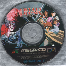
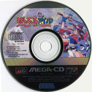
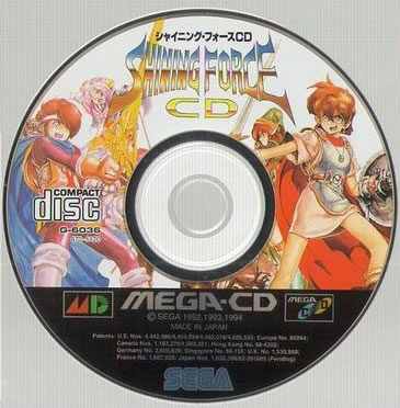
Since Working Designs wasn't involved with the Japanese release, this time the credit clearly goes to Game Arts. Unlike the U.S. version, look at how this one cleverly divides the composition into two halves. To the right, delineated by Alex's sword, you'll find all five of the good guys. On the other side, a dark villain and red sun define the bad guy space. Follow the lines of nefarious figure and the sword and you'll see that they obviously clash, helping inject an otherwise static composition with urgency. It's too hard to choose a best disc this time. Both are very impressive. |
|
| |
|
|
|
|
|
Working Designs strikes again, and this time the result is perhaps more beautiful than Lunar. The good guys once again find themselves on the right, but check out the river and verdant space surrounding them. The foliage is gorgeously detailed, flowing naturally around the curves of the disc. Looking up the river and towards the horizon, where you'd expect light to be brightest, you find the hole for the CD. This is an excellent example of how to take advantage of this peculiar canvas and turn its limitations to your advantage. Easily one of the best compositions for the Sega CD. |
|
Compared to the American version, this is kind of like looking at an artist's unfinished draft; the characters are identical but the background is sketched in and not fully colored. The frostiness of the river and trees detracts from their true splendor. Popful Mail's arm is unfortunately cut off by the center of the CD. Canvas is also wasted with the black stripe at the top and the silver one below. It's a good composition, but the inescapable effect of hindsight screams to you that so many elements could be improved to make it as glorious as its counterpart by Working Designs.
|
|
| |
|
|
|
|
|
|
|
|
Among the devoid-of-composition discs, this represents an improvement. The stark use of black definitely sets it apart and helps the title leap off the disc as well. That we are spared random crappy text, like welcometothenextlevel, is also fortunate. |
|
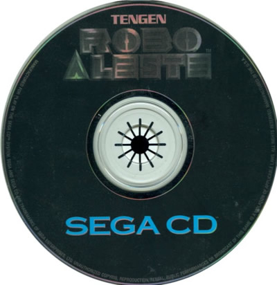
In the tradition of Final Fight, we have another disc with colors that are complementary to the extreme (i.e. ugly). Beyond that issue, this is a solid composition, and the feudal Japan-meets-robot mech gives you a sense for the title's unique setting. |
|
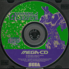
The easy winner! This isn't the best scan, but you can still appreciate the contrast of blue/black and orange/red. That's how contrasting colors should be! The European disc tantalized us with the an intriguing mech, and its awesome to see that concept explored in greater depth and detail here. |
|
| |
|
|
|
|
|
|
|
|
Simple and iconic can work, but in this case, it doesn't. The crown at the top is less detailed than the ones that you get for free at Burger King. The average third-grader can doodle more interesting sword designs. The lack of effort is startling, given the popularity of this franchise. |
|
Once again, we must contend with the limitations of a less than great scan of a rare title. You can tell, though, this is a lot like the Japanese version of Ecco. The composition is a bit less detailed, and you can get the general image of a figure on each side. Even with all the uncertainty of what they represent, this must be better than the U.S. version. |
|
The manga style art is kind of average (not nearly enough spiky hair), and the composition is rather boring, just a bunch of characters standing, two on each side. However, with the other versions setting the bar relatively low for quality, the better use of colors and detail push this one to the top of the pack with ease. |
|
| |
|
|
|
|
|
|
|
|
This is far from a masterpiece, but it could be a whole lot worse. The title looks decent. Nothing insulting is embossed in giant letters across the disc. If you look carefully, you can even see the faint outline of a ship, firing into the foreground. Very solid by the (low) U.S. standards. |
|
The PAL region slips in the standings. Bad enough that there's no real artistic composition. Worse still, the red polygons and white gears actually make the disc look worse than if it followed the more minimalist (i.e. pur silver) approach that's seen on so many American discs. |
|
Nice title, fading from blue to black with stars, and the schematic of a space ship. In short, we're already light years ahead of the other versions. Good compositions don't have to be brilliant or innovative, they need to be effective. This one—quite elegantly—accomplishes just that. |
|
| |
|
|
|
|
|
|
 |
|
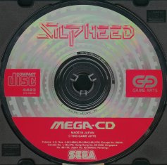
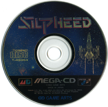
The detailed, hard-to-appreciate blue composition strikes again. Impressively, it has infiltrated all three regions. You might think you're missing something here. You'd be wrong. Even if you have the actual disc in front of you, there's nothing more than a pixilated blue cloud. What a waste and tease of potential.
|
|
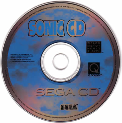
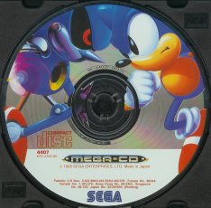
Instantly, you know that Sonic's great rival will be Metal Sonic in this game. The disc doesn't bother with a proper title—why should it?—Sonic, himself, is iconic. Metal Sonic's red eye evokes that of The Terminator. See how each foot pushes off of the CD boundary? Like Working Designs' Popful Mail, it makes clever use of the canvas. |
|
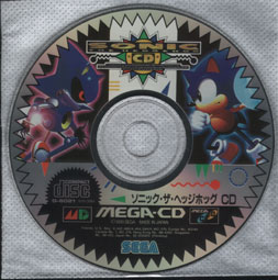
Like Popful Mail, once again you get that first draft feeling. Metal Sonic vs. Sonic is a great concept, but everything else about the composition misfires. The saw blade border distracts from the main event. Lots of space is wasted with lettering and graffiti. We can tell this is a Sonic game without all of that garbage. |
|
| |
|
|
|
|
|
You'd be correct to assume that once again Working Designs is in charge. That said, this is a bit of a disappointment. The composition is clumsy—look at how the red head floats in the air, next to a green castle—seems incongruous. Check out those facial expressions, too, has everyone been lobotomized? The elements (characters, villain, castle, and sky) seem haphazardly lumped together in general. Nothing ties the disparate elements together. |
|
Perhaps this background pattern is integral to the game, or maybe the colors have some unique significance. This is a rare example where the Japanese composition lacks ambition relative to its American counterpart. You find the block letter title up top as well as an artistic rendition of the very same title on the right—redundant. Yet somehow the remaining space on the canvas is never put to good use. Quite peculiar and disappointing. |
|
|
|