Box Art Disparity:
FDS vs. NES
|
1 May 2011
You can't really do a regional comparison when a console was only released in one region, so this Box Art Disparity installment is a little different. We'll compare FDS box art to its American and European counterparts. Though the 8-bit and 16-bit retro scenes are thriving today, few retro gamers are aware of the significance of the Famicom Disk System, the ill-fated and never-released-outside-of-Japan add-on to the Famicom.
Some of the most important franchises were born on the Famicom Disk System, and thanks to an additional sound channel they often out-performed their cartridge counterparts (but that's a topic for another feature).
In Japan, most of the games below were only released in disk format for the Famicom Disk System; consequently the Japanese Wii Virtual console actually includes Famicom Disk System games (find the recommended list here) in addition to Famicom ones.
As you look at all the boxes below, you may be surprised to find that for the first time ever in one of these features, the Japanese box art is bringing up the rear, usually struggling to match that of its American and/or European brethren. Nevertheless, hopefully along the way you'll gain a new appreciation for a console and Nintendo game medium that never made their way outside of the Land of the Rising Sun.
|
|
|
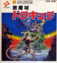
Akumajou Dracula (aka Castlevania) |
Pretty brilliant start for the franchise—Dracula's face laughing in the ominous sky, his castle, and Simon in the foreground swinging his whip. It's a brilliant use of colors, contrast, and also an excellent illustration of gameplay. |
|
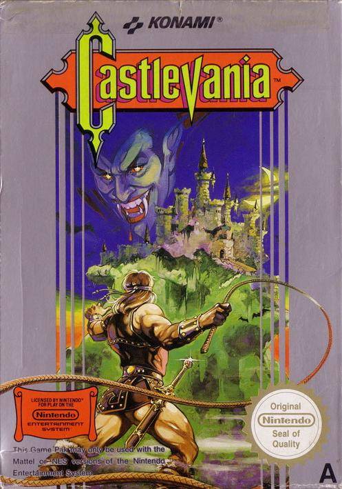
Little really changes. You do lose the rocks to either side of Simon, which hurts the perspective a little bit, but beyond that everything else is intact. The title definitely has a gothic look and this is overall a gorgeous example of box art.
Moving the title to the top of the box helps you fully appreciate Dracula's face, blood drips and all. Overall the gray background is also a better choice. |
|
|
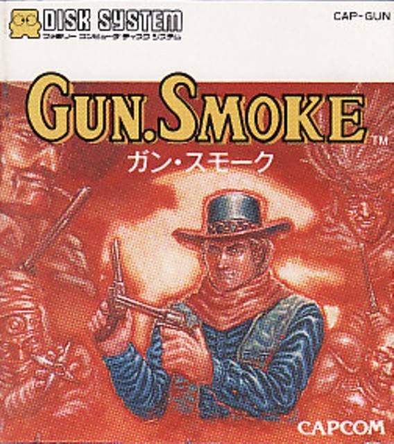
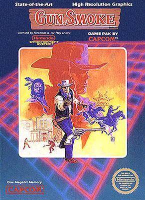
It's a rather simple layout, our gun slinging hero in the middle, framed by a sizzling sun, and the visages of—presumably—boss enemies lurking along the red border. The yellow and orange haziness throughout really pulls the composition together and also gives you a great feel for the game's setting. Very nicely done. |
|
The relatively small square of artwork is actually quite good, from the foreboding silhouette in the background to the gunslinger in the foreground. It's everything else where this box loses ground, from the dark purple border to the neon purple graph paper attempt at adding depth. At least we have "high resolution graphics!" |
|
Kudos to Europe for trying something different. Too bad it ends up being such a mess. The art is really three separate images crammed together with little effort at transition or clarity. Without a border at the top, it also looks like the composition is unnaturally slammed upwards, along with wasted empty space below the title. |
|
|
Hikari Shinwa: Palutena no Kagami (aka Kid Icarus) |
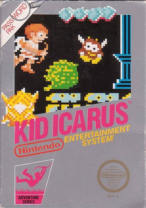
Kid Icarus looks a bit dopey in his sandals and with his blank expression, but at least the cover provides a sense for the gameplay and the setting. The Greek temple floating atop the clouds alludes to the setting, and while the brick border isn't great, it's better than the cream color normally used. |
|
In a flash of silver, half of the canvas disappears before it has the chance to be used. We're left with a goofy and smiley Kid Icarus flying towards a—what?—floating turd? While abstract pixilated art can really grab your attention, this box provides much that is silly and little that inspires a purchase. |
|
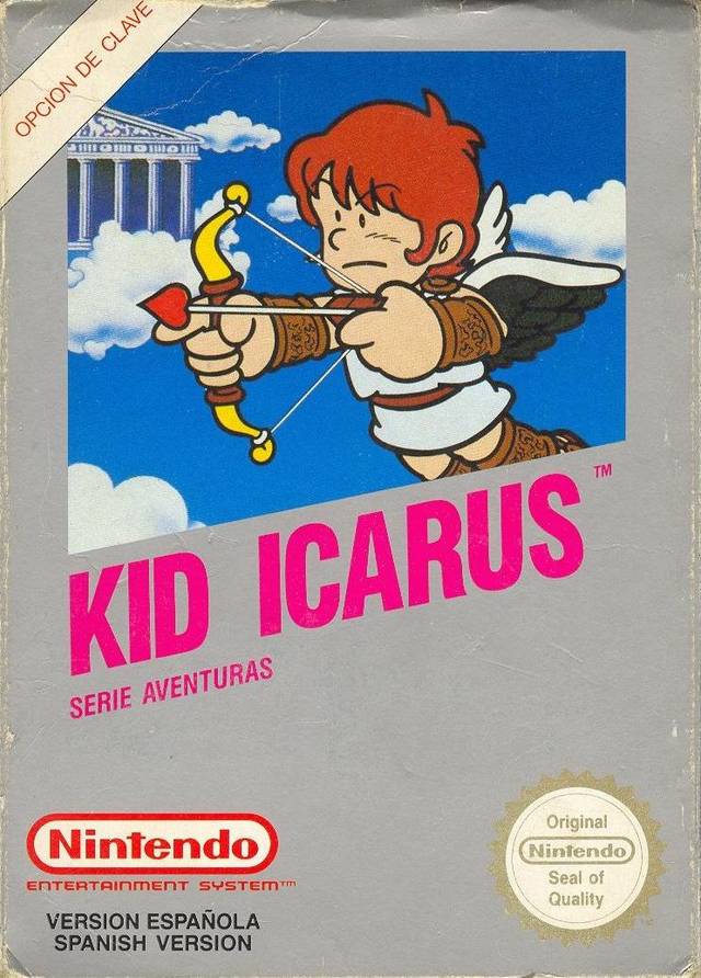
Like the U.S. box art, a tremendous amount of the canvas is squandered. Fortunately, the composition takes the Japanese original and basically improves on it. Kid Icarus is angled downwards to match the slop of the title, injecting the composition with a much sharper sense of action. Too bad he's still so blank-faced. |
|
|
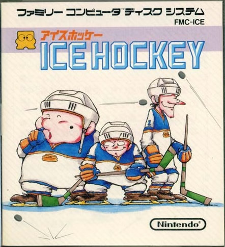
What a great and stylized depiction of gameplay. The three different builds—you'd better believe that size does matter in this game—of players are immediately evident. A few pucks skitter across the rink to inject some action into the composition. Simple, yet quite effective. |
|
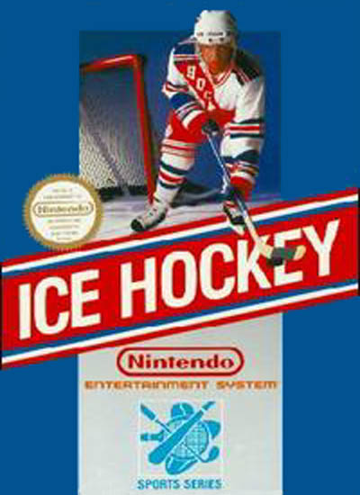
It's hard to imagine much of a contrast in tone, from like-hearted cartoon to—I guess, grim—photo realism. Nevertheless, you end up with a boring box that fails to suggest how interesting and fun this game actually is. You'd never guess that different physiques could impact gameplay so much. Could the cover of an ice hockey game get more generic? If you're going to take this photo route, couldn't we at least get a better action shot, rather than merely have a doofus skate forward with a puck. Funny how the colors echo the U.S. flag; I thought baseball was the all-American pastime. |
|
|
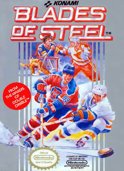
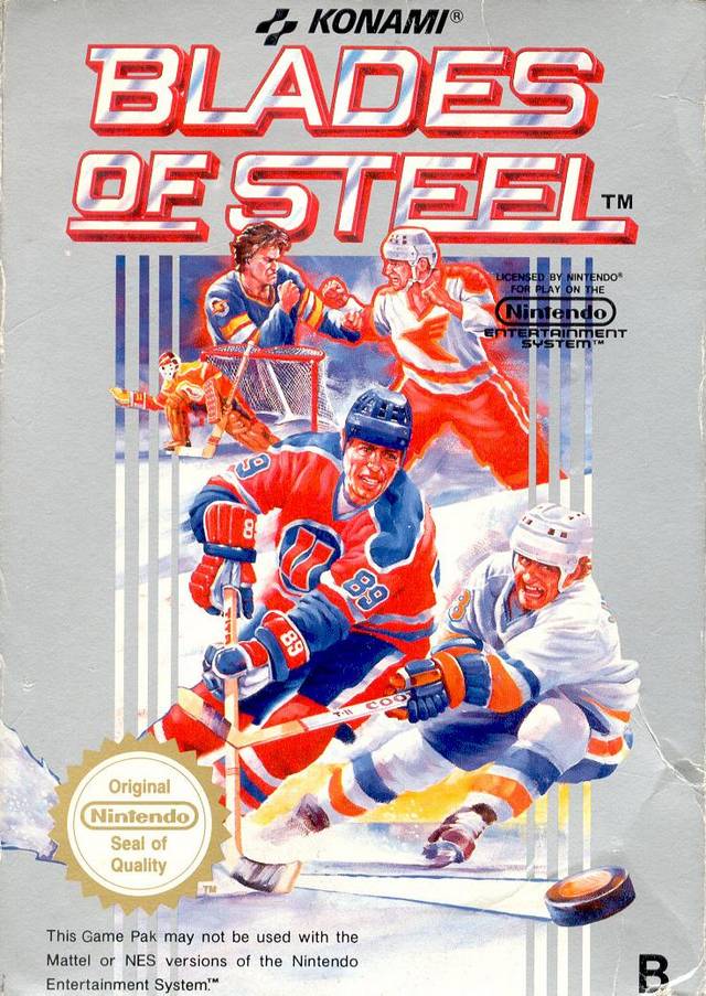
Konami Ice Hockey (aka Blades of Steel) |
This scan is actually for the disk sleave, not the box (which seems to be impossible to find in a decent resolution). There are no significant artistic differences between the former and the latter. Anyway, this is a solid composition, depicting three different action scenes, and using washes of color (red, blue, and white) to isolate each component. |
|
At first glance, comparing these to the Japanese original, you'd think just the players in the background have changed, but look again—closely. Even the two large guys up front have been edited significantly, from the color of clothes, to the numbers on the uniforms and the removal of the third hockey stick. In the background, the addition of two guys who are clearly engaged in a fist fight suggests that Konami's marketing people believed violence would help sell games outside of Japan. Gone are the washes of color, and it seems like all the players occupy the ice rink at the same time, which is a little odd, especially with the tiny orange goalie crammed in between the players in the background and foreground. |
|
|
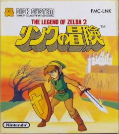
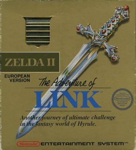
The Legend of Zelda 2 (aka Zelda II: The Adventure of Link) |
This is one of those rare examples where the Japanese artwork comes up quite short. Link leans forward awkwardly, wearing...a mini-skirt??? The castle is a wasted white mess. There's way too much yellow and orange everywhere, and what's with the tri-force sneaking up behind Link? |
|
Now this is more like it.
Simple, iconic, even gripping. With such an enchanting weapon featured prominently, you don't even need the word "adventure" in the title. Face it, every kid's dream is to find a magical sword and embark on some incredible journey fraught with danger. Err, well, that was always my dream.
The gold box and bright gold cartridge peeking through the slot is the icing on the cake. Everyone want's the special-colored cart. |
|
|
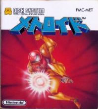
Samus strikes an awesome and intimidating pose here. It's sort of a shame, though, that the explosion conceals her coolest weapon: the arm cannon. The red background does a fine job of emphasizing movement, but beyond that you have to admit that it makes the overall composition appear to a bit lazy. |
|
The box art format for the early NES games has grown on me since doing the black box art feature. That said, there are a few issues here. Why are the enemies so disproportionately large? And it looks like Samus is wearing an old diving suit helmet on her head! With all the blue and red and yellow/orange in the art, the gray border is pretty ugly. |
|
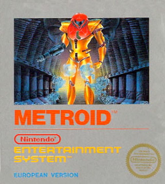
And now for something completely different. Well, Samus is clad in the same colors, but everything else has changed. Nice to see that her arm cannon is prominent (albeit an odd color) and her helmet looks tough, rather than foolish. The ominous hallway is a welcome addition, but what are those cloudy blobs around Samus's legs? |
|
|
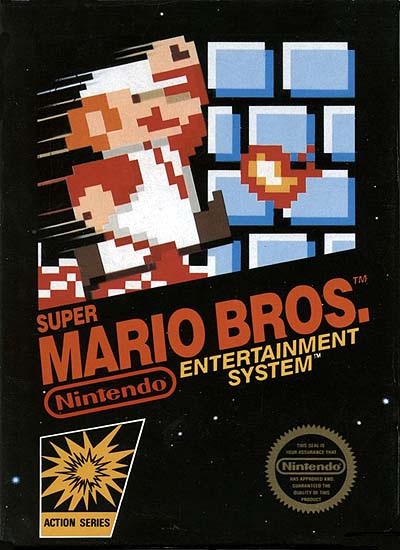
This composition is very frenetic, but the cartoony Mario ensemble is well rendered. There are, however, a few peculiarities, like Bowser being gray, and he's apparently carrying castle on his back. As with many of these boxes, the cream colored border is an unfortunate choice, providing little contrast for this rich piece of art. |
|
Flower power Mario is looking good, and you have to love the pixilated fireball. These original launch boxes definitely seize your attention. The composition, nevertheless, could be more coherent. Mario appears to be kicking a brick wall, and what is that brownish ground below him supposed to represent? |
|
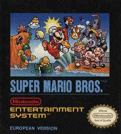
What a difference cropping the composition makes, look how the wider view here opens up all the characters along with the cliff and the castle. Thank goodness the cream colored background has been done away with in favor of black, which helps make the myriad characters jump out of this composition. Quite an improvement. |
|
|
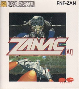
Holy bad title placement, Batman! WTF? Of course, if you haven't seen the U.S. version you don't know what you're missing. The title chops up the composition into two distinct pieces, making you ponder the significance of strange clumps of gray and blue jet streams. It's interesting to note that "AI" is in this title. I guess that refers to the artificial intelligence that the game uses to adjust difficult on the fly, based on how well you play. |
|
|
|
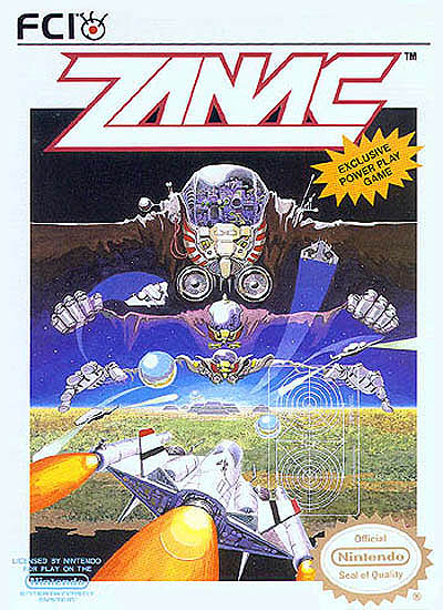
Now we get to see the entire composition without any interruptions. It's actually a brilliant depiction of the "System" from Zanac's story taking control, starting with hands open over a planet, then first clenched, and finally dominating throughout space. With the title moved up top, you can also appreciate the paths of the other spaceships, the targeting hairs, and the power-up orbs. The U.S. box art definitely wins this round. |
|
|
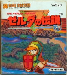
Zelda no Densetsu: The Hyrule Fantasy (aka The Legend of Zelda) |
Although this is definitely an improvement over Zelda II, it still could be a whole lot better. Why is Link so disproportionately large as he crouches in the water next to Hyrule? The saber looks like the one in the title screen, but where's the creativity in that—odd that no swords in the actual gameplay look like that one. Overall, it's a decent effort, but you'd expect more for such a groundbreaking title. |
|
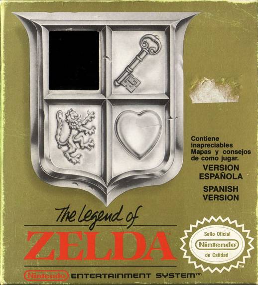
This cover pushed iconic to an even higher level than its sequel. Obviously, we have three components: the key (to unlock doors), heart (life container), and the lion rampant (symbolizing bravery and strength—yeah, I had to look that one up). Look at how they're all enclosed, by a shield. Think a little more abstractly and it can also double as a window, giving you a tantalizing glint of the mysterious cartridge inside.
The text about including maps and playing tips is pretty hilarious when you recall that one of Nintendo's biggest concerns was that this title would be too challenging for non-Japanese gamers. Don't worry about these strange symbols on the cover, we'll provide cheats to make your game playing easier. Nevertheless, this is a unique and awesome composition.
|
|
|
|