Box Art Disparity: How Graph Paper
Can Wreck a Composition
|
23 August 2010
You thought you saw a blowout before in this series? You ain't seen nothing till you look at this, which—like other installments of this series—focuses on games that are actually good. If you want to just chase Master System box art badness unto itself, it gets even worse. I always thought that the purpose of box art was to use it as a vehicle to overstate the quality and graphics of a game. Apparently, Sega approached marketing from a very different perspective. Here's how I envision big Sega discussing the issue:
Sega CEO: So how are we going to market these games in America?
Marketing Lead: We're going to do something totally different, games really stand out.
Sega CEO: OK, tell me more.
Marketing Lead: We'll use a background that looks like graph paper, and it will cover at least half the box.
Sega CEO: Yes...
Marketing Lead: Then the graphic depicting the game will be as simple as possible—
Sega CEO: —So when someone actually plays the game it looks even better!
Marketing Lead: Exactly.
Alright, I might have exaggerated a little bit, but every single box in the left column features that graph paper look. Though Sega Master System games were released in four different regions, when you talk box art differences worth noting it really boils down to Japan vs. the world (some particular boxes are hard to find, but given what I've seen so far I highly doubt that the Brazilian boxes below differ substantially from the American or European ones). Basically, it boils down to graph paper versus the absence of graph paper. The overall quality of non-Japanese box art is, therefore, not surprising... |
|
|
|
|
 |
 |
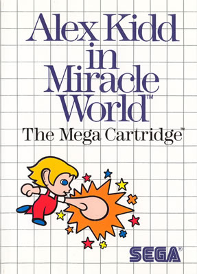
Mop of blond hair plus some crazy blue eyes and voilà we have on monkey boy who likes to punch things. What does he like to punch? Thin air apparently, or the occasional piece of obnoxious graph paper when given the chance. Seeing box art like this, it's shocking to realize that Alex Kidd in Miracle World was one of the best-selling games ever released for the Sega Master System. |
|
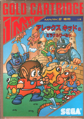
It's obvious that some actual effort went into the art here. Look at all those colors! There's even a background! The Kidd actually looks like a monkey boy, too. He's still smacking things, though. Why's he going through all this effort? Well, he has a fetish for princesses with green hair and crossed eyes. Duh. Plus, he can tell that he out-muscles everyone else, given how large he is in the foreground. |
|
|
| |
|
| |
 |
You immediately get a sense for the setting and atmosphere: spaceships and science fiction. Yes! But it seems odd that this little spaceship is flying directly into a strange creature ringed with orbs. Also, note that there aren't any anthropomorphic qualities evident in the spaceship (a.k.a. our sentient hero, Opa). What little artistic effort there is fails almost completely at expressing the genre or the depth of characterization. |
|
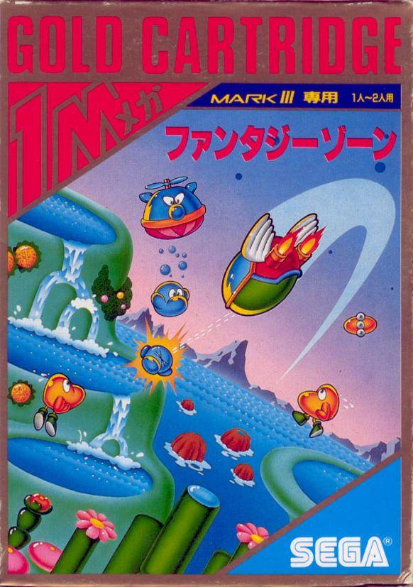
Look at all the key differences. This time, there are some cute little wings on the spaceship (a.ka. Opa). More enemies abound, and they're more expressive, from the cross-eyed annoyance of enemy spawners to the grimace of defeat. Speaking of which, there's actual gunfire, making it obvious that this is a shoot 'em up. The art even delves into gameplay, with that helicopter pod belching out little chunky blue guys. |
|
|
| |
|
 |
 |
Witness the impossible. This box art is actually better than its Japanese counterpart. Sure, our hero has ecto green hair, and the enemy appears to be a giant heap of landfill, but other than that everything looks quite good. Plus, check out that cute princess, sporting her virginal white dress! |
|
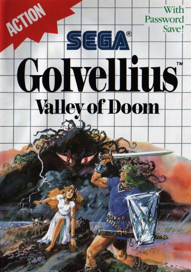
While it's nice to see a composition that fills almost the entire box, there are some major issues here. The skeletons are everywhere, even underneath our mini-skirt-wearing hero's crotch. Meanwhile the blank-eyed princess is having trouble keeping up so she grabs his arse. |
|
|
| |
|
|
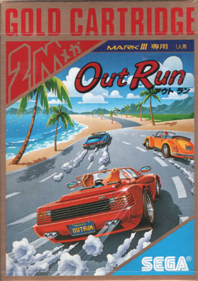 |
Perhaps you thought you had come to grips with the sub-par box art for all these releases outside of Japan. Well, did you think it could get this bad for such a high-profile title? What the hell kind of car is that? A clown car that didn't make the cut for the circus? The new Smart car with no rear of the car at all? At least it's driving fast...Straight into a palm tree. |
|
Now that's a real Ferrari. It looks like it might even be racing some other cars. Imagine that! A horizon that's got palm trees, a beach, and the ocean. Generic blond in the seat next to you. What more could you ask for? Everything appeals to your base instincts and gets you amped to get behind the wheel. There's nothing clever about the composition, but it speaks clearly. |
|
|
| |
|
 |
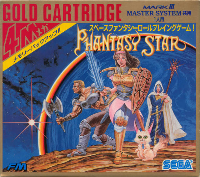 |
While better than many other examples, why choose a pink cloud for the background? Doesn't seem very threatening or exciting. What's that muscle-bound gug doing on the right, besides sporting a metalic bikini? Some good things here, but rather uneven overall. |
|
What a difference a real background makes. The character portraits aren't much of an improvement over their non-Japan brethren—the burly man is still wearing a metal bra, but at least he has a battle axe this time. Fortunately, the great contrast with the foreboding planet in the background helps bring these characters to life. While far from brilliant—look at that cat—it's obvious that this composition is much better thought out than the one released outside of Japan. |
|
|
 &  |
|
|
|
|
Man's technology against nature's freaky creatures—R-Type's conflict is immediately apparent. You even get a hint at how to defeat the first boss, Dobkeratops. Shoot him in the eye below his face! Note the primarily two-color palette, orange on the left for the enemy and blues on the right for our space-faring hero. Some of the other U.S. boxes in this list have action, but nothing this intense. |
|
Here's a much more minimalist approach with the composition. The blue versus orange appears again, and the graph paper background is a welcome omission, of course. Everything is much more mysterious—you can't even tell what genre you're dealing with. Gone as well is any clear sign of conflict or action. That said, there's no denying that this is a gorgeous work, rivaled only by Ys in terms of Japanese boxes on this list. |
|
|
| |
|
|
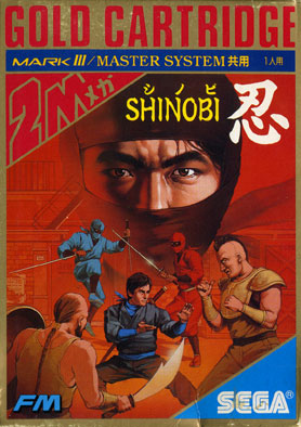 |
I don't know of any any ninja-based title in the history of video games that has a less inspired piece of box art than this one. It's as if the "artist" brainstormed what made him think of ninjas and ran out after black face mask (officially known as the shinobi shozoku) and throwing stars. Even these few aspects are poorly executed. Shinobi's face has some decent detailing but his uniform is little more than a black blob. Don't even get me started about the pale purple haze surrounding his head. |
|
Arrrgggg! There's so much going on in this composition that my small American brain can't handle it. Let's start at the red wash of a background; looks like the first level, clearly depicting platformer elements. In the middle level we have sword-wielding ninjas, but are they friend or foe? Then in the foreground we have a clear battle going on, again a throwback to the first stage. This is another excellent example of a limited color palette and very nice detail in every single aspect of this composition. |
|
|
 &  |
|
|
|
|
 |
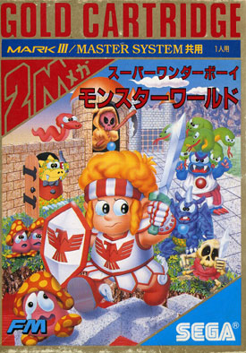 |
What an ugly looking mop of blond hair. Could those eyes get any more crazy? Not crazy cool, but crazy freaky. The sword is so sharp that it's cutting through graph paper; I guess that's sort of cool. Looks like the orange knight slipped on some invisible mud. That old trick gets 'em every time. And what's that standard on the shield supposed to represent. This is awful to the core. |
|
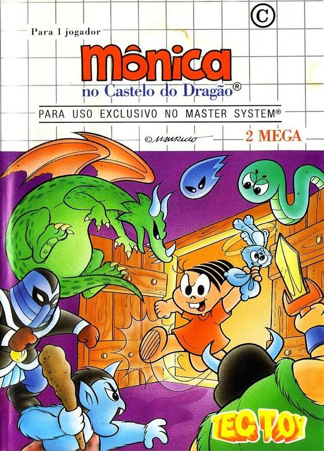
Yes! These Brazilian boxes are hard to find, and it seems rare that they're significantly different from their U.S. and European counterparts, but this one is quite compelling. Gone is the scary and chunky look of the EU/US and Japanese versions. I vastly prefer the true cartton look above. A nice contrast of blues and greens against the orange and purple. Could have done without the graph paper, haha. |
|
As if things weren't weird enough in America and Europe, here they get even stranger. Now Wonder Boy looks like some freakishly large toddler, but at least his eyes are goofy instead of freaky. Are all the surrounding enemies dropping acid? Their faces range from miserable (crying!) to confused and stoned. Maybe they've chomped on some of those mushrooms. |
|
|
|
|
 |
 |
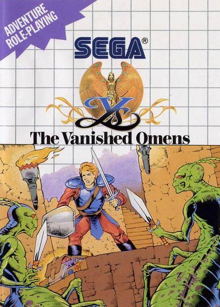
Alright, we've got a pretty solid layout, with the warrior closing in on the Brood-like (X-men anybody?) enemies—all of them brandishing swords. After that, things go south pretty fast. The color selection is muted at best and ugly at worst. The inking (sticking with the comic book theme) is also lackluster. Overall, a very average, which makes it quite good by non-Japan standards. |
|
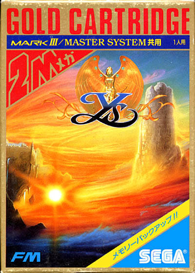
O. M. G. This has to be one of the prettiest examples of box art ever, but not quite as good as Ys I & II. Look at the way the wind carries those radiant oranges and yellows across the landscape. You also get a nice hint at the genre with the tower's ruins and the crumblind castle. There are even some breaking waves in the foreground, adding to the natural theme, as well as providing excellent contrast. |
|
|
|
|
|
 |
I don't know about you, but when I see a game that involves operating a futuristic microwave in order to cook space invader alien rejects—well, I impulse buy it on the spot! Granted artwork for the regions beyond the Land of the Rising Sun has been consisteny weak throughout this feature, but it ends on an appropriately ultra weak note. EPIC FAIL. |
|
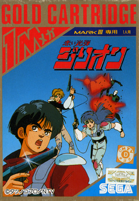
Zillion's animé roots are immediately evident. I guess everyone is dropping through the air? Or maybe the artist was extremely lazy with the background. Look at those puffs of blood, though. Long before Wolfenstein's gorey violence, we had it here before you even turned the game on. In terms of handling the American release, I guess Sega feared the Joe Lieberman test. |
|
|
|