Box Art Disparity:
Super Nintendo/Famicom and European Borders
|
13 February 2010
The war of the box art takes an interesting turn here, yet Japan preserves its edge. Though European box art often leans closer to its Japanese routes than its American counterparts, in this box off the U.S. versions hold a distinct—albeit technical—advantage over their European brethren.
Based solely on the use of border colors—an apparently minor issue—U.S. box art is almost universally superior to its European counterparts. Having a border color that works with the central composition is essential, and too often the PAL box art ignores this cardinal rule. |
|
|
|
 |
 |
|
 |
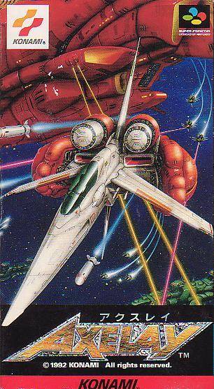
The long-nosed spaceship with its tall tail fin fills up the vertically-oriented box perfectly. The behemoth cruiser in the background provides a great sense of perspective and the odds against which you're going to be fighting. Lazers, missiles, and enemy space craft are already hot on your tail. You could easily imagine this artwork on the cover of a sacrifice anime movie. Note how effectively the rather limited color palette is employed. The dark blue of space glues everything together and beyond that only red, white, and green dominate the composition, aside from the occasional odd color seen in lazer blasts or missile exhaust.
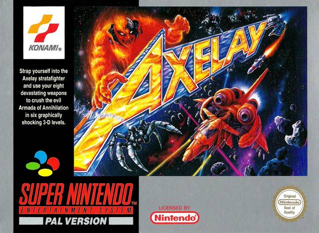
Outside the Land of the Rising Sun, we find something completely different. By U.S. standards, it's still pretty good--not as good as the Japanese version, though. You need the game title somewhere, but slashing across the middle of the box like that only distracts, making the action less coherent. Obviously, large enemies (bosses actually) are after you, but wouldn't this be more intense and harrowing if the flame boss wasn't be blocked by an AX? And what about our heroic and outnumbered spaceship hero? Apparently it's been chugging too much space fuel and pigging out on extra armor, because it looks much chunkier than its Japanese counterpart.
For those not familiar with PAL boxes, welcome to the first of many lessons in the dangers of contrasting colors. All the silver border does is make you realize how much space on the canvas has been wasted. The black border on the U.S. version at least kind of blends in with the space background. |
|
|
|
|
 |
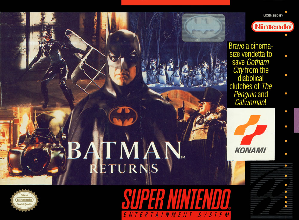 |
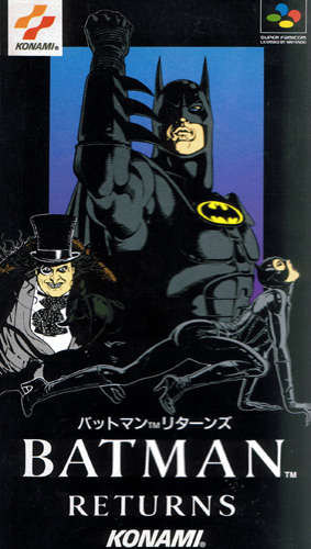
The Japanese box art obviously appeals to the classic Batman fans; these characters could have jumped off the page of
many a DC comic book. Each character is depicted with its own unique body language, especially Catwoman's butt thrusting right around where Batman's...utility belt is located. The characters appear larger than life thanks to the way they stretch to the very edges of the box.
The American version obviously aims at action movie fans, probably trying to extend the audience beyond hardcore comic book readers. Basically, it's a four-image collage with Batman pulling it all together in the center. It's a solid ploy, but it comes up short. Are those really the best four stills from the movie? Furthermore, the blending of all the black colors simply doesn't work as well as in the Japanese box art. |
|
|
|
|
 |
 |
|
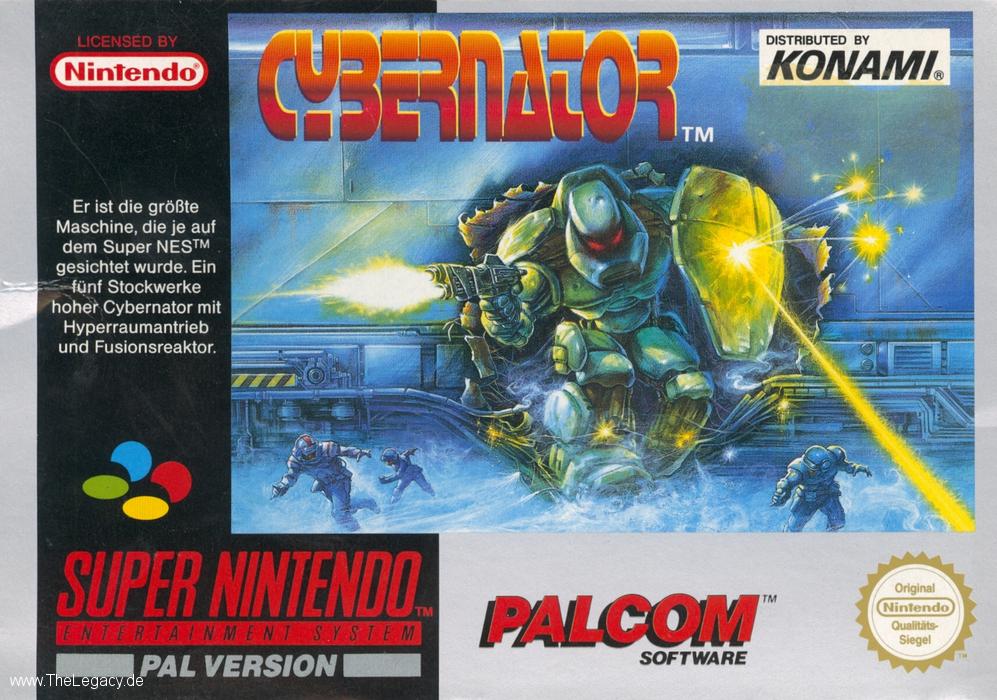 |
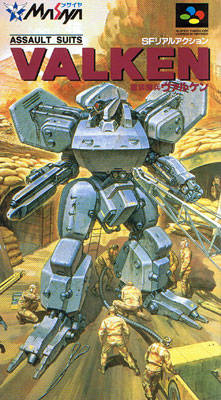
None of the art on these boxes is that thrilling. On the Japanese side, we have this huge mech apparently hanging around while it gets repaired. Perhaps these are emergency repairs, as the explosive dust cloud in the background suggests—That would make it a little more exciting. Although the discriminating use of color can really help a composition maintain coherence, the focus on gray and yellow in this one is quite ugly.
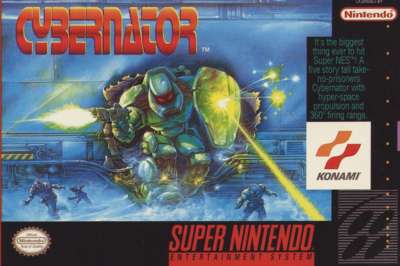
At least when you look at the U.S. artwork something interesting is happening. Admittedly, only after staring at it did it become obvious that the mech was bursting through a wall—that hole looks too circular and perfect. It also feels too symmetric in general. Imagine how cool it would be if instead the mech was bursting through a wall on the left side of the composition and gunning down a giant opposing mech in the foreground. I will give some extra points for the menacing red eyes, reminds me of The Terminator.
The silver border may be a little jarring, but at least there isn't a block of text infringing upon the art work. The European version, overall, looks a little bit better than its American counterpart. Nevertheless, this battle of the boxes is more-or-less a draw; all three pieces of art are solid but unremarkable. If forced to choose one, I suppose I'd go with the European version. |
|
|
|
|
|
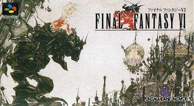
Yoshitaka Amano. Need I say more? Yeah, he's kind of good at art. He has a knack for capturing the tension between high fantasy and science fiction. I could harp on the cream-colored background being a little lazy, but everything else in the composition is so rich and hyper-detailed. Each spire has its own characteristics, and it even looks like the hot air balloon has a cannon protruding from it. This kind of art pushes your mind into overdrive, as you try to interpret and understand every detail. |
|
|
|
|
I'm a fan of elegance, and there are only three elements in this composition: title, shadow, and Mog. Thanks to the simplicity and bold images, this art work catches the eye quite nicely, and thankfully the black background actually matches the black border of the box. Had this game been released in Europe, you just know there would have been a silver border that clashed horrendously. Had I not seen Amano's work, I'd be content with this simple and effective approach. Why abandon Amano's masterpiece? Did the Japanese assume that the art had to be dumbed down for Americans. |
|
|
|
|
 |
 |
|
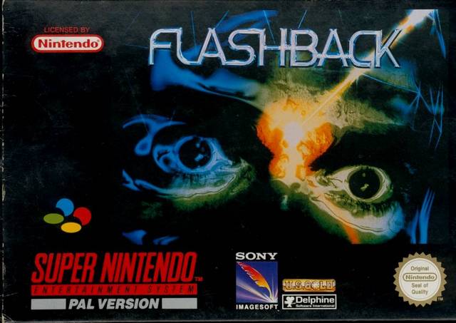 |
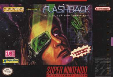
Blam! Lazer to the face! That's a cover that demands your attention—at least the Japanese and European versions do. The watery eyes make it much more dramatic, horrific even. This time, for a change, it's the Japanese version that has issues with the border around the art. What's with this faint blue line, and why does it need to form a trapezoid above the title? It would have been nice to have this haunting face extend to the left edge of the box. Amazingly, the European art work has a black background for the entire box, which blends perfectly with the art. For once the European border is a boon, helping it edge out the Japanese version.
Was the lazer to the face too violent for the American audience? Perhaps, because U.S. games received something much less violent and exciting. The space-like background, eye piece, and lizard face all look pretty good. The problem, however, lies at the very center of the composition. This protagonist looks extremely dorky and zoned out. His eyes are wide open as if he's seeing something shocking (interesting), yet his moth and facial features are totally serene (huh?). While the lizard face breathing smoke looks pretty sinister, the graph paper grid framing the image seems rather silly. Overall, this piece of art fails to become something better than its individual parts, and even the parts have obvious flaws. |
|
|
|
|
 |
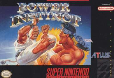 |
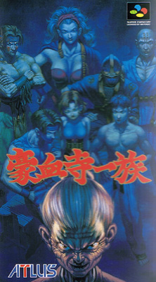
Evil Granny is the focus of the Japanese composition, and the use of blue does a brilliant job of imitating a camera's focus. While Granny is sharp and close with whites and pinks, the group shot of the other characters is covered in a watercolor-like blue wash The final product is that Creepy Granny seems to be right in your face, maybe even leaping out at you. That all of the characters behind Granny are well rendered and looking natural is a bonus.
On the other hand, in the United States you also get only two characters and an extraordinarily boring background. If the roundhouse kick at the center of the composition was really impressive and convincing that would be one thing, but it's not. The characters have strange facial expressions and it's only with a 60s era Batman exaggerated yellow impact explosion that the action begins to come to life. |
|
|
|
|
 |
 |
|
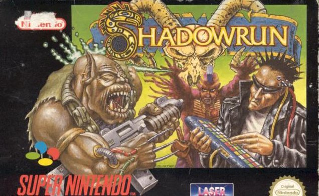 |
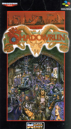
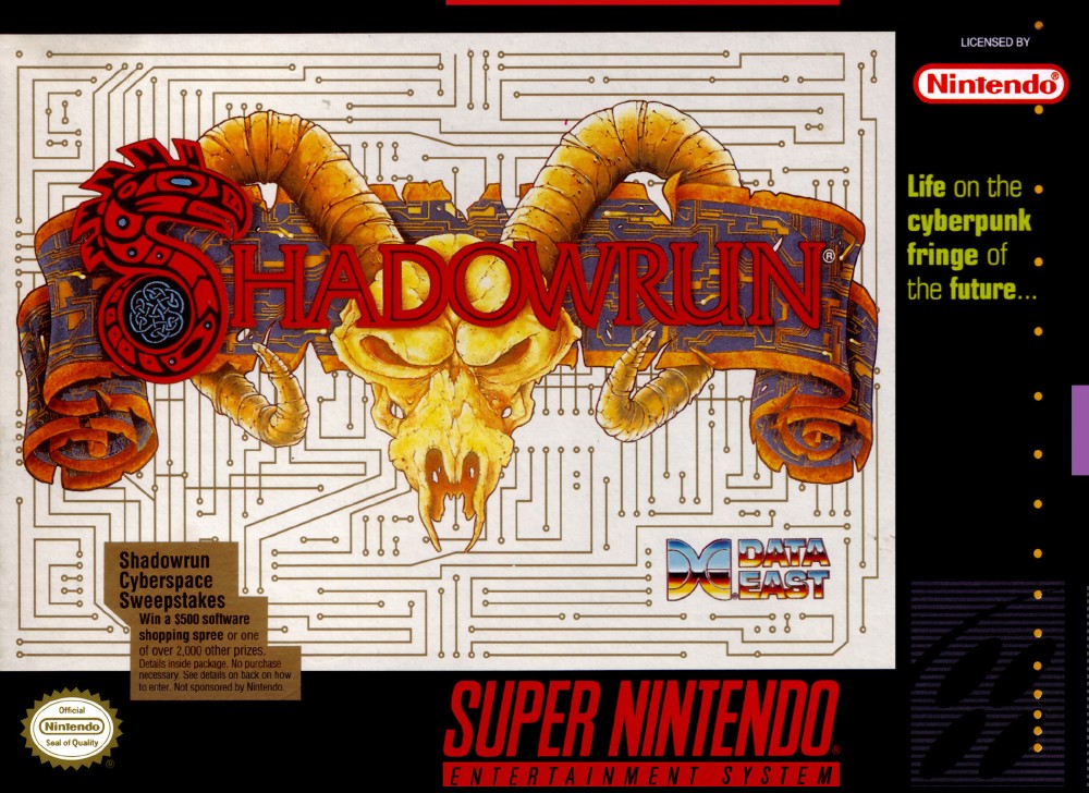
THIS! IS! CYBER-PUNK!—not to be confused with Sparta. Japan presents a very impressive piece of box art. The style feels like it's lifted from a comic book, and it's an excellent homage to Blade Runner. A red and evil world looms above. Then there's the glowing—almost haunting—title below. Dominating the box, we have the seedy underground with its unusual focus on purple and even a purple-haired woman. This is a level of detail and composition rarely seen in box art of this era, so naturally it wouldn't be carried over to the U.S. and European releases.
To transform the Japanese box for a U.S. release, basically you strip out all of the detail, keep the logo, and apply an extremely boring circuit board background. Nothing but white and lines of conductivity. Yes, the title jumps out very nicely, but it's also basically a non-composition, just a logo mounted on a background.
Thankfully, the European box art spices things up a bit. I'll give points for the effort, sure. Whether the addition of these characters is positive, though, is debatable. Does the addition of a portly mutant with a gun against a spiky-haired dude with a synthesizer make you more tempted to purchase this game? The layout is also unfortunate; look how the skull from the title nestles itself between the arm and the head of that bizarre guy with the purple mohawk. |
|
|
|
|
 |
 |
|
 |
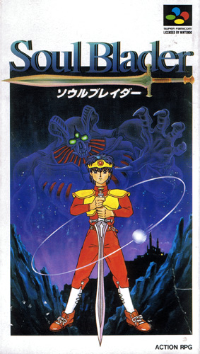
In general, I'm a big fan of animé art, but this Japanese box tempts me to reconsider this predilection.
The goofy hero floats above the landscape with a sword that he points downwards as if it were an extension of his... great fortitude.
Meanwhile, a peculiar hose-beast reaches out at him from a fairly generic background.
So little thought has gone into making this composition interesting. It stinks like bad cheese, the kind that smells horrible, and tastes worse.
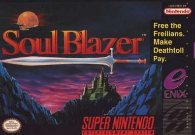
Normally, I'd criticize the U.S. artwork for being less ambitious, but in this case the limited focus is actually an advantage. A red title, plus an impressive blade, foreboding castle, and an ominous skyline create a much more enticing invitation to adventure. We'll just pretend that the comment about "Free the Freilians" doesn't exist.
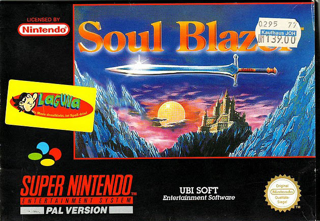
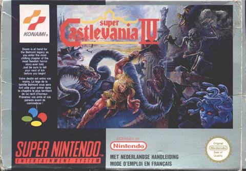
**Edit on 11 March 2010 — Thanks to a forum member at Retro Gamer Magazine, I now have the PAL box art as well, so I've added it to the mix. I'm so happy to complete the trio, thanks buddy. Getting down to business, this is better than Japan but worse than what Americans received. Shrinking the art rarely helps the cause. Adding a gleam to the sword and lightning up the sky—apparently that's what happens when you slide the sun down closer to the horizon— removes the tension that the darkness creates in the U.S. version. The red line separating the art from the bland remainder of the box only makes it even more obvious how much of this canvas was wasted. |
|
|
 |
|
Now it's time for something special: Awful Japanese box art! It does happen, and this is a prime example for a rather famous title. The long hair, the less-than-manly blue armor, the peculiar curve to the whip—Even Dracula looks silly! Even if you ignore the individual figures, the dominant colors across the composition (red, blue, gray, and purple) look pretty terrible together. Considering the rich (vampire) source material, it's hard to believe that the color black was not used more judiciously. |
|
 |
|
Were it not for the horrendous Japanese box art, I'd complain about how this composition could be much better, but there are some high points worth identifying. Our hero has a dramatic pose, and he doesn't look like a goof-ball. Clearly, he's swinging his whip at some very nasty monsters. The balance of colors works much better as well, on one hand the dark blues and blacks, and on the other the yellow and red of the hero, plus the bright reds and yellows for the necessary title and branding. There's a sense that Simon is leaping out of the darkness, while all sorts of demonic creatures are emerging from the depths. Overall, the action is a little hectic, yet it works rather well in terms of the use of detail and accents. |
|
 |
|
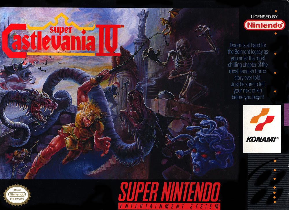
This is one of the better examples of how much damage an off-color border can do to the central artwork. Gone is the overshadowing and dark intensity seen in the U.S. box art. The bright silver border lightens up everything in general, and it appears that the original artwork has been lightened up as well. The skeleton and medusa no longer slink into the shadows as effectively. Now they look foolish, like they're hanging out , exposing themselves to Simon's whip. It's bad enough the the composition becomes more mundane, but the box as a whole suffers tremendously as well. You no longer have a contiguous and coherent work of art. Rather, you're left with a disjointed work. |
|
|
|
|
 |
 |
|
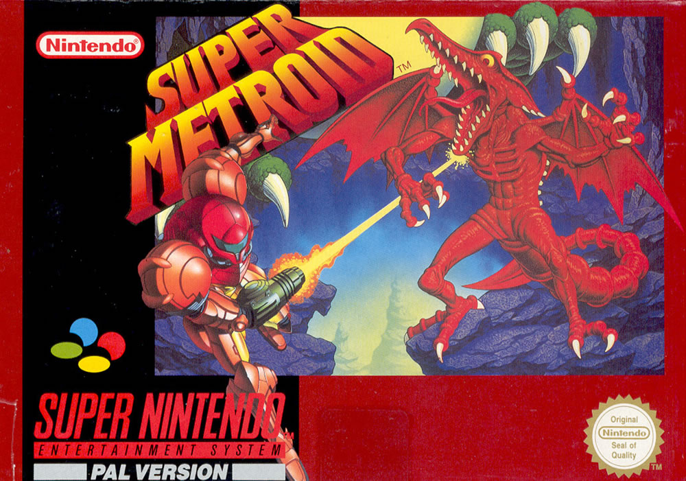 |
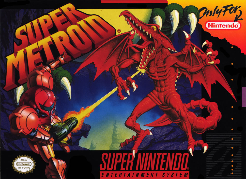
Look at the depth and scope! Samus may be masked and stoic, but that dinosaur-like enemy patently expresses its shock and pain. Metroid offers a dark and cavernous world, with many creepy enemies closing in. You'll also find excellent use of color—green and blue define the background while red and orange cause the protagonist and the title of the game to pop out. In the end, this is a rich and complex composition, striking an excellent balance between the art and the necessary branding.
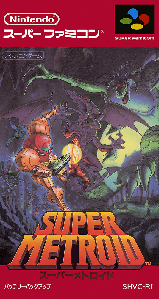
Knowing only the U.S. and European artwork for Super Metroid, you might be okay, able to overlook its highly stylized nature. But once you've seen what Japan has to offer—no way! Gone is any depth. The pterodactyl-like enemy has metamorphosed from scary to silly. All attempts at presenting a pleasing range of colors have been abandoned as well. Making matters worse, you find a bizarre dinosaur claw reaching over the edge of the box. It's astonishing to see such a klutzy and gauche portrayal of a game that is actually so dark and gorgeous.
As happens so very often, the European approach is identical, only you add in a border that f$^&s with an already poor bastardization of the Japanese original. The red border only further lightens the tone of what was originally a fairly intense confrontation between Samus and a monster. It also creates additional separation between the box and the art that adorns it—rarely a good thing. |
|
|
|