Box Art Disparity: Japan Retains
Advantage Over US and EU
|
7 November 2009
The Box Art Disparity feature on the TurboGrafx-16 was so popular that I decided a follow-up was in order. Establishing trends gets a lot more complicated when you add a third region (in this case the EU) to the mix. Nevertheless, the artistic story remains rather consistent. While the EU and US run a pretty tight race, the stupendously awful box art for Elemental Master (not released in the EU) catapults the US to #1 for crap box art. At the other end of the spectrum is Japan. Sure, sometimes it gets edged out, but its game covers never fall into the realm of epic failure.
Interestingly, regional trends in art quality run contrary to the economic success of the Mega Drive. In Japan, where art was generally better than in the US and EU, the Sega Genesis never emerged as a viable rival to Nintendo's Famicom and Super Famicom. However, in the United States and Europe, where game art tended to be worse than in Japan, the Genesis managed to not only compete with Nintendo but even best Big N in market share for the short-run.
Maybe box art was less important during this video game period. Video game information and the Interet were more prevalent than during the transitional 8-bit to 16-bit TurboGrafx-16 era. Or maybe there's a problem with the hypothesis that box art has a substantial marketing impact at all. In any event, these regional artistical differences remain fascinating—at least to me—and I hope you enjoy the comparisons and commentary below. |
|
|
|
|
|
 |
|
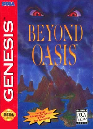
Sinister eyes and dark clouds pique one's curiosity, yet the overall composition has more of a lighthearted Disney feel. Solid art, suggesting a mysterious land to explore and a sinister force imposing its will there. |
|
Here's a more abstract approach. The sandy background and scimitar definitely make you think Arabian Nights. Would have been nice to see another silhouette to offer a little more insight into the characters. |
|
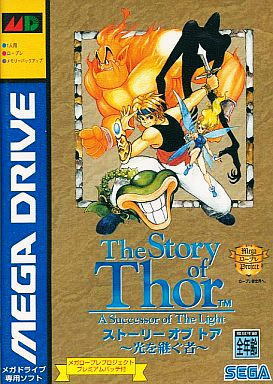
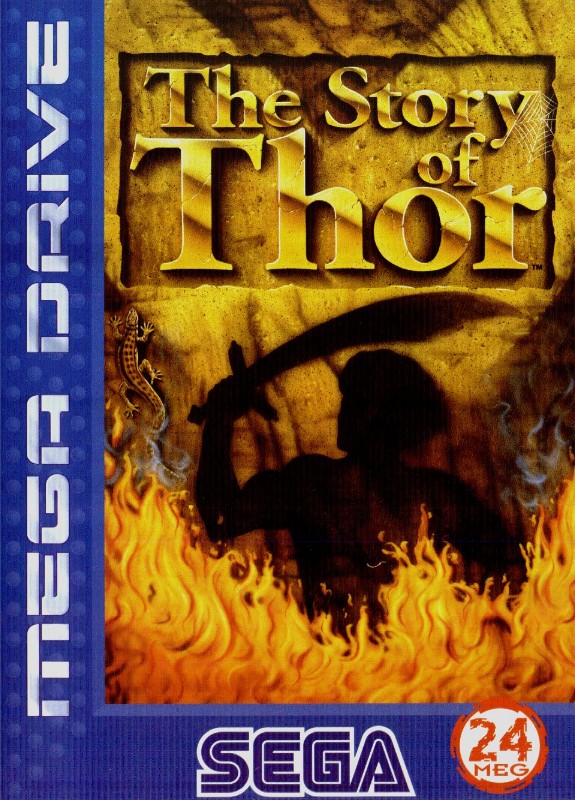
Finally, we have a much more plot-based angle, where apparently Thor teams up with various odd characters to fight an evil sprit? The layout and title provide a nice novel sort of feel—makes sense for the genre. |
|
|
|
|
 |
 |
 |
The "hero" looks like he's having an acute neck spasm—or maybe he's constipated? Bright reds and yellows offer nice contrast, but they take away from the dark atmosphere depicted by various undead minions. |
|
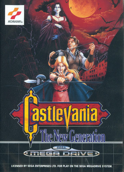
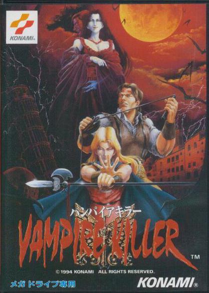
Three distinct, well-drawn characters, and a perfect crimson/black theme throughout sets the mood perfectly. Showing Eric on the cover is smart marketing, even though he does look exceptionally feminine. |
|
The zoomed in art cuts out most of the black shadows from the EU version—too bad, since they add such a suffocating feel. Vampire Killer may be the better name, but the lettering needs more contrast. |
|
|
|
|
 |
 |
 |
Firing a big gun at a big boss is a great description of the gameplay. Artistically, there's great depth and perspective here with the hallway stretching into the distance, yet a mechanical hand threatening our hero in the foreground. |
|
The four playable characters match the title; in other words they look stupid and ridiculous. Restricting the color palette can do great things for pulling an image together, but nothing can save these clunky and awkward character designs. |
|
Not surprisingly, this offers a much more animé style. Showing all four playable characters plus two others is ambitious, yet the leaping into action of the sky pulls it together. Impressive that a purple and pink skyline offers such ideal contrast. |
|
|
|
|
|
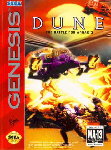
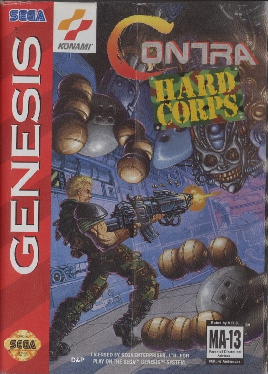
Pretty hard to argue with this one. Thanks to the red and orange tones of the explosion and sky, for once the conspicuous red Genesis stripe on the left side of the box actually doesn't detract from the art. Soldiers, helicopters, and blasts. It all looks very good, but chances are that you've seen it a million times before, which brings us to a much more different take on depicting this title... |
|
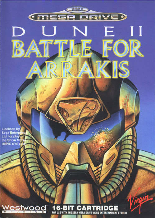
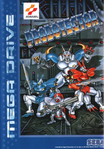
Different title, very different art, but the same Dune game pictured to the left. Talk about iconic. The soldier's helmet fills almost the entire box, and right in the middle, where your eyes are naturally drawn, you can see the action. Effectively, this tells the same story as the US art, but in a much more original way. Bold art like this makes a game practically jump off the shelf. |
|
|
|
|
|
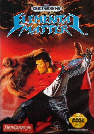
When the protagonist even slightly resembles a profile of David Hasselhoff, you know you're dealing with a marketing disaster. Who would be willing to be seen picking up a game with this face on it? The risk of being caught. The ignominy that would follow. It doesn't help that the Hoff's red cloak makes him fade indistinguishably into the background. And check out those skin-tight pants! |
|
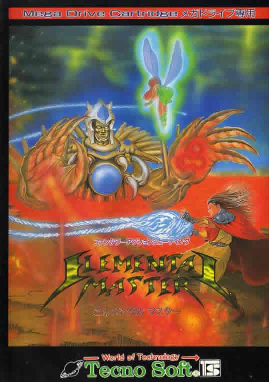
Anything would be better than the US version, but what we find here is still rather weak. At a glance, it's an ugly mish-mash of orange, red, blue, and gold. The gigantic villian just nearly blasted our hero while the latter is firing in totally the wrong direction. Looks like Tinkerbell is on his side, too, but she's just hovering, bending over provocatively to show off her butt. Strange, overall, and little that inspires you to buy this game. |
|
|
|
|
|
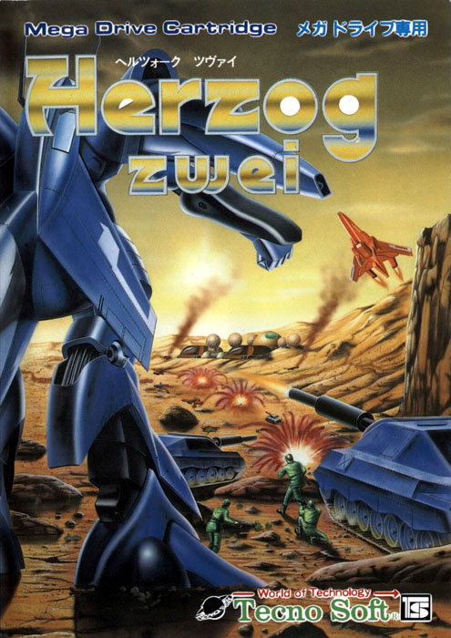
Now we're talking! An excellent action shot of futuristic war. Great perspective, too, with the close up of the fighter plane and its rocket about to finish off the mech in the distance. We've also got a solid introduction to the game, itself, seeing the various types of units in action and the sci-fi setting established as well. (Note: The EU release features the same artwork). |
|
Very similar in concept to the US/EU box art but not nearly as successful. Everything looks static—gone is the sense of action and intensity. The mech in the foreground isn't really doing anything. The tank seems to just sit there and lob rounds. The contrast is uglier in general and the art is less detailed as well. It's also odd that the green soldiers look like the plastic toy kind from Toy Story. |
|
|
|
|
|
|
|
And you thought John Morris looked goofy! Our hero apparently prefers blue spandex and coiling his sword arm back in the most unnatural way possible. Try that pose. I dare you. Everything else looks colorful and goofy, too. |
|
Getting rid of that red Genesis stripe always helps, especially when the art is devoid of red. On the downside, the extra space for the art leaves our hero's crotch and blue spandex in the absolute middle. Not the best place for your eyes to gravitate. |
|
The blur of the sword. Dropping through the air. Action! Plus, the hero doesn't look like a complete dork. Armor and a cloak suit him much better than spandex. The obligatory dark night and black knight lurking in the background. So much better! |
|
|
|
 |
 |
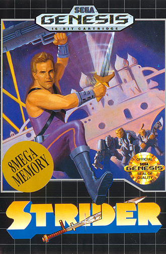
Infamous as one of the worst pieces of video game art in history, this cheese offers the Flash Gordon movie some serious competition. What a goofy, clunky, hero. That the sword looks more like a large dagger doesn't help, either. He's fighting what exactly? Monkey-faced men? (Note: The EU release features the same artwork). |
|
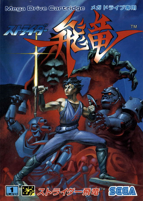
What a fine example of a focused three-color palette. That's the kind of kick-butt sword I'd expect Strider to wield, even if the hero does look a little on the young side. Enemies present an interesting array of the mechanical and magical. While there are no monkey-men in sight, that one robot does have an uncanny resemblance to a gorilla... |
|
|
|
|
|
|
|
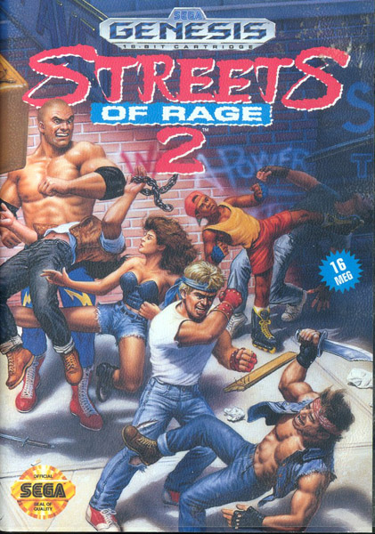
Things are looking a little busy here. Decent composition. Would have been nice to see a better likeness for the characters. Blaze is wearing the wrong color, and I guess the giant in the upper left is Max? Not sure what the girder jutting out in the upper left accomplishes. |
|
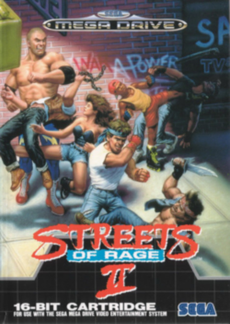
Again, we find a slightly tweaked version of the U.S. art. Unfortunately, the repositioned lettering is a nuisance, because it obscures the knockdown punch Axel delivered to that knife-wielding punk. For some reason, items on the street (knife, paper) have been removed, too. |
|
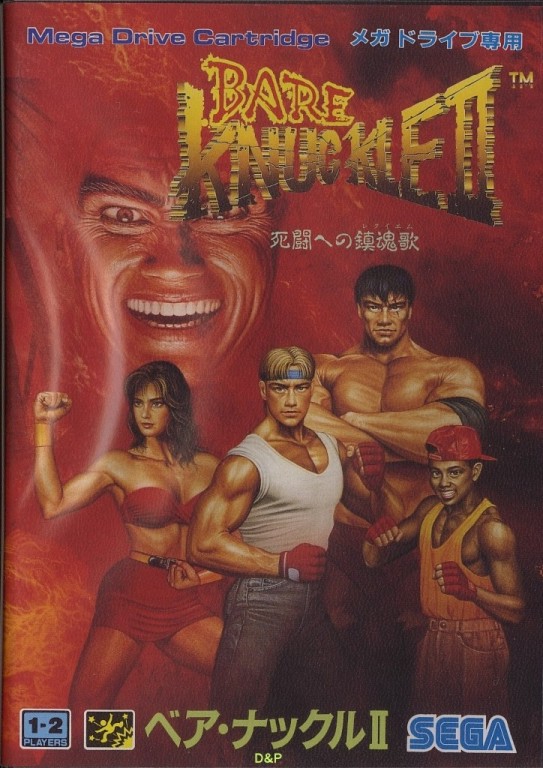
This version takes a more focused approach—all four characters primed for action, and the maniacal villain on their minds. It's also a much darker setting with red gloves, red bikini, and the red background suggesting anger and violence. That the different title sounds cooler is a great bonus. |
|
|
|
 |
 |
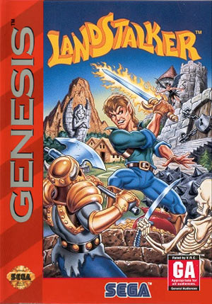
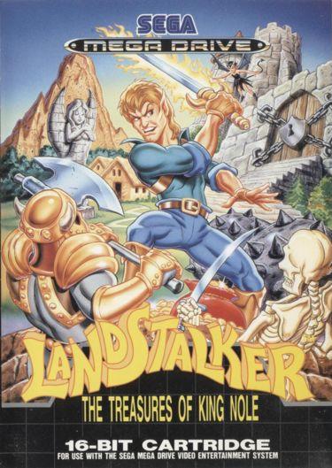
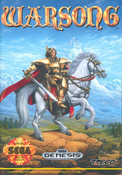
There's nothing strictly bad here. Nice colors, nice contrast, no red Genesis stripe. That the art for a fantastic world is so unimaginative, though, is a little disappointing. A knight on a horse with a castle in the background has only been done—what?—a bazillion times before? |
|
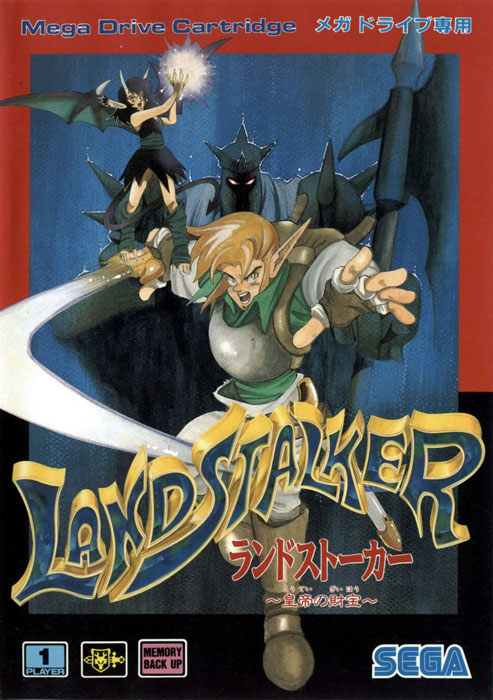
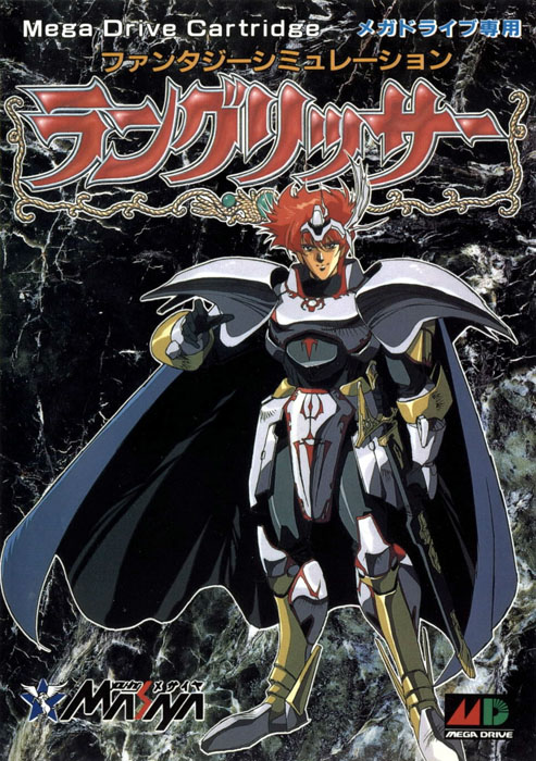
Given the predictable animé route, this spiky haired hero is not unexpected. The lack of detail in the background seems lazy, but it does make the portrait pop out nicely. The Hero's pose is clever, one hand reaching out toward you, the other on his sword. Not great, but better. |
|
|